SaaS Product Onboarding Chat
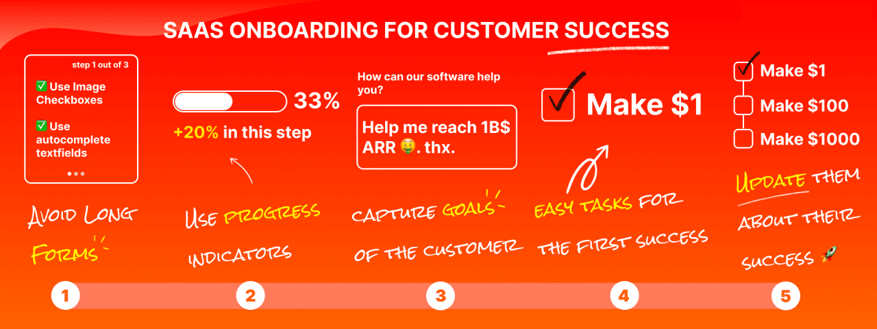
A user has to go through a series of wonderful journeys from the time he/she discovers your product, uses your product, and finally stays and becomes a valuable user. Onboarding is an extremely important part of this journey. Today, I will talk about Onboarding. If there is anything wrong, you are welcome to criticize and correct me. At the bottom of the article, there are some useful websites for you. Students who are not interested in the main text can go directly to the bottom to check out the websites.
Onboarding - New user onboarding guidance refers to teaching users how to use your product. Personally, from the perspective of a "seller", the ultimate goal is to let users discover the value that the product brings to him/her. As Yu Jun said, we are exchanging value with users to achieve a win-win situation. Only when users discover value can there be subsequent activation, retention, income, and recommendation.
Traditional Onboarding only refers to letting users get started with your product. New ideas believe that Onboarding should not stop at user onboarding. We should look at Onboarding from the perspective of a whole journey. Onboarding starts with SEO and ends with continuous payment. Please note the word "continuity". It is not just one time or one or two months, but continuous payment. It is very important to maximize the user value, especially for SaaS products.
So how to do Onboarding well?
Understand who your users are.
To do a good job of Onboarding, the premise is to understand who your users are, what industry? What position? What scenario? What is the company situation? And so on. There are three main purposes for understanding who the users are. The first is to build a user portrait, and the second is to facilitate follow-up sales in the later stage, so that the third party can do customized novice guidance.
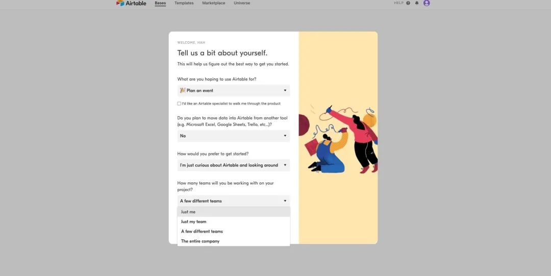
Of course, we can't throw a bunch of questions to users after they register, and ask them to fill them out one by one. This will cause disgust (making users feel that you are snooping on their privacy) and may also lead to a huge bounce rate (of course, some people do this, such as airtable).
Therefore, the way of asking questions is very important. We must always think from the user's perspective. When users see a question, what they think in their minds is "What is the benefit of answering this question for me? What will you do with these questions? Will it leak my privacy?" For example, if we are a cloud table product (similar to airtable, Weige, Feishu Table, etc.), if you want to know what industry the user is in, please don't use the direct questioning method of "What is your industry?" It is recommended to use "Please select the industry table template you need", and then list templates of different industries below the question for users to choose. In this way, the user gets what he wants, and you also get the user's industry information, and the answer is more credible than the answer obtained by direct questioning (the user is likely to fill in the answer randomly), a win-win situation.
There are many more techniques for question design, and I will chat with you later when I have time. We just need to remember that if users pay the cost, they must be given corresponding rewards. This is a positive cycle.
Well, I said a lot above, but it is all empty, because the final result (Object) we want is retention and payment, and the methods mentioned above may not be applicable to your product, so please look at this problem with dialectical thinking (for example, in the figure below, Airtable throws a bunch of questions for users to fill in after successful registration). Everyone should judge what method is most suitable for your product based on the bounce rate, response rate, retention rate, and user interview results of their own products, and continuously optimize. Please remember to continuously optimize!
Customize the user journey for each individual.
For SaaS products, users may have different industries and different application scenarios. We can divide them from these dimensions and customize personalized journeys for users. We all know that different users have different functional requirements for products. Let's take the example of Cloud Spreadsheet. People in different industries have different requirements for templates. The scenarios used by different positions in the same industry are also different. For example, the Internet industry uses zoom, and R&D engineers mainly use it for remote meetings. Most of the time, only voice and video communication is required. For market operations, in addition to voice and video, they may also need screen projection and sharing demonstration solutions. Obviously, different functions have different values for people in different positions. The function of screen projection and sharing is of great value to market operations, but it may not be so valuable to R&D engineers. Based on this, we may try to let students in market operations experience the value of voting and sharing functions as much as possible when guiding novices, so that they are more likely to stay.
Remember, the essence of customizing personalized user journeys is that different users have different functional requirements for products. How to divide user types? What type of users expect what functions the most? This requires specific analysis of specific problems. We can verify and explore based on product features, user interviews, AB testing and other methods.
Different guidance methods are used in different scenarios
After completing the first two steps, let's take a look at the guidance methods. Currently, there are three mainstream methods: step-by-step guidance, video tutorials, and customer service guidance. These three methods are often used in combination.
Step-by-step guidance: Usually triggered when the user first registers or clicks a button, interactive guidance allows users to operate step by step, and ultimately achieves the purpose of guidance (as shown in the figure below, the novice guidance of Pitch).
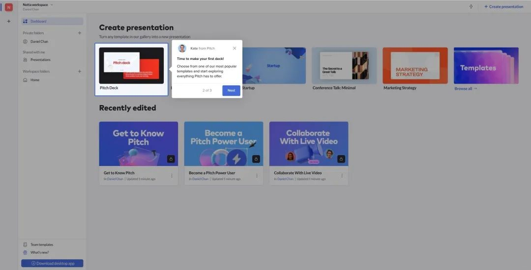
Pitch's novice guidance
Video tutorial: Teach users how to operate directly through a video. The advantages of video are: richer elements, sound, animation, and users can watch it repeatedly. Usually, we use video tutorials when the operation is more complicated or when we need to express the design purpose to users in words (as shown in the figure below, the video tutorial of Wrike).
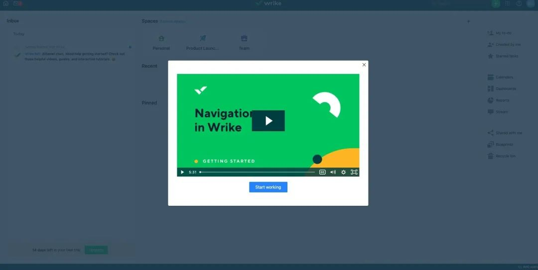
Wrike's video tutorial
Customer service guidance: Sometimes the above two methods still cannot cover all user operations. At this time, customer service guidance is needed, such as integrating Intercom (as shown in the figure below), which can actively trigger guidance through conditions, or directly send guidance or FAQ to users in the customer service chat window.
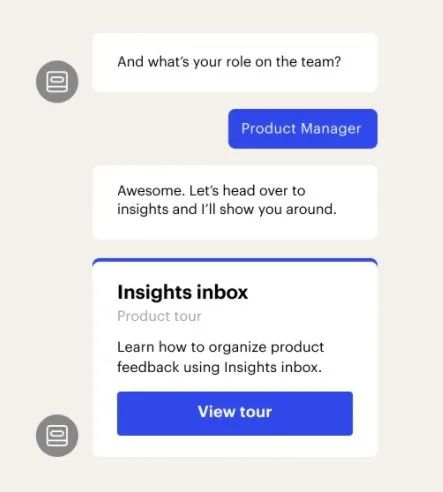
Intercom guides users directly in customer service chat
We can see that many products will provide step-by-step guidance for some basic operations after users enter, and other complex operations may be taught with video tutorials. We can also give users a checklist (as shown in the following figure Appcues' checklist), similar to the novice tasks in the game. After completing all the novice tasks, they will receive certain rewards such as credits, which can be used to enjoy discounts when subscribing to membership.
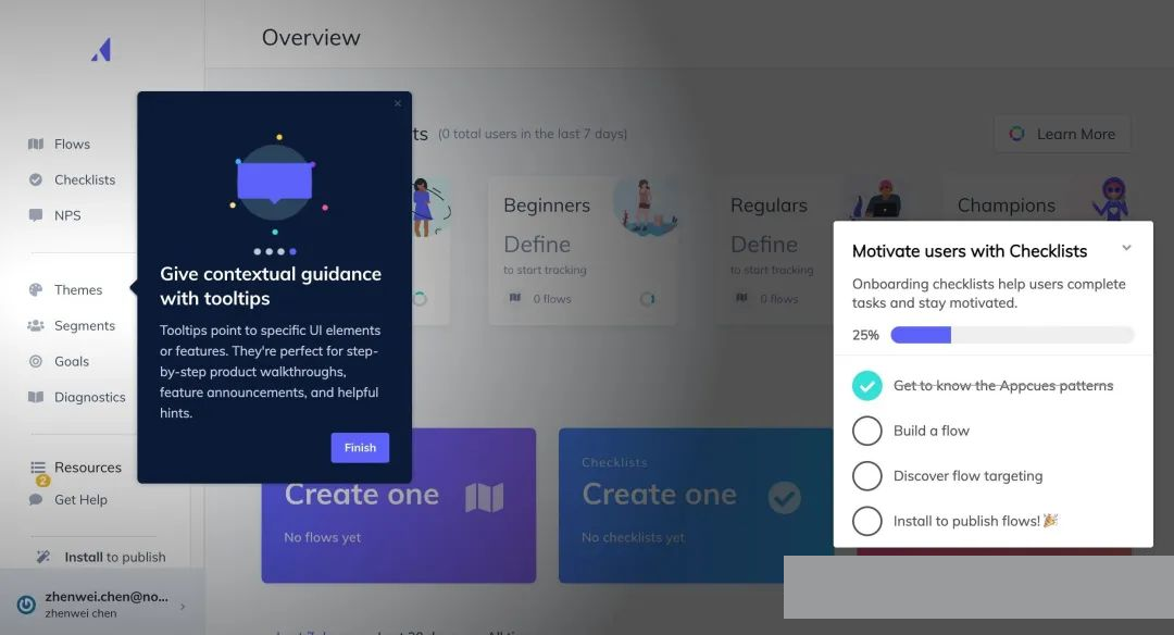
Appcues' Onboarding checklists
There are several details worth noting in the guidance design. (1) When designing checklists, please use the completion progress percentage (50%) instead of 5/10. Studies have shown that using percentages makes it easier for users to complete checklists. Of course, the same old saying applies. Please verify which one is more suitable for you. (2) When users just register, automatically help users check the first checklist to complete, so that users are more likely to continue to complete all tasks. (3) Provide mandatory guidance for necessary operations, but trigger guidance for non-essential operations. For example, if a certain function is the North Star indicator of my product, and users have a very high probability of retention and conversion after using it n times, then we try to make this function a mandatory guide and try to let users trigger and use this function more often. For non-essential functions, it may be triggered only when the user actively enters a certain page or clicks on a certain module. It is also a good choice to directly make a video so that users can watch it when they need it. (4) If necessary, users can be guided again. (5) Guidance design also needs to be continuously tested and optimized. Remember, there is no best, only better.
Email is very important! Welcome, activation, recall, etc. all rely on it. Email also plays a very important role in Onboarding. It is the best way to reach users outside the system. We can put new user guides, key function introductions, GIFs, demonstration video links, etc. in the welcome email. Users will be very happy when they receive the welcome email. This is also a way to interact with users emotionally (the picture below is an activation email sent by clickup, with GIF tutorials, avatars, signatures, etc., but I added mosaics to protect the other party's privacy). Details of email design (1) Do not use "XXX Marketing Department" in the signature of the email. Please use your real name, preferably the CEO or founder. This will be more friendly and make users feel respected. (2) Emails can also be personalized based on user portraits.
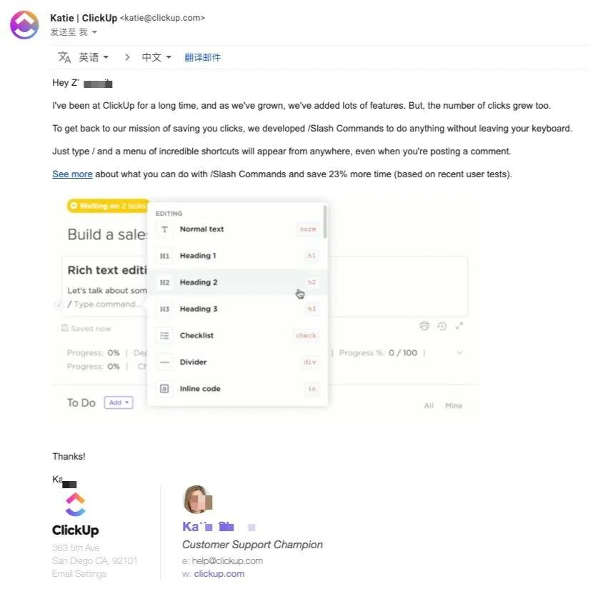
Let users continue to explore and use your product.
User needs are constantly increasing, and surprise needs will gradually become basic needs, so we must continue to surprise users (the premise is to ensure the stability and reliability of basic needs). Although we have done personalized guidance, you must know that we also personalize by dividing users into large categories. From a personal dimension, each user must have the functions he/she wants, so it is important to let users understand or experience your product functions as fully as possible. Generally speaking, when a user uses a product, he/she will use one or two functions frequently. This is the core of his/her stay, and other ancillary functions are icing on the cake. These icing on the cake functions give him/her more reasons to stay. When creating new functions, remember not to deviate and must focus on the core of the product.
Continuous optimization
Remember that our core goal (O) is to retain users and eventually turn them into continuous paying users. Then the conversion effect of Onboarding is the indicator we should always pay attention to. Please remember that all the suggestions and methods mentioned above are not applicable to all products. They are just for your reference. We should always look at these issues with dialectical thinking. Through repeated testing and verification, find the method that best suits your product and continuously optimize it.